OK, so I finally started. Since I was terribly procrastinating with actually doing anything with this project (and not because of the fear of success, I’m afraid), I decided to start easy: with the layout.
I have to admit that Android Studio (which, following the Google’s advice on their Android developers’ site, I did install), really tries to be helpful. Admittedly, it is like an overgrown Alsatian: drooling and irritating (I wish I was the author of this beautiful and graphic metaphor; I took it from a two-decades-old book on MS Windows 3.1, where it also fit perfectly…). Of course, I’m pretty much biased. I’m accustomed to a philosophy where things software can do are not advertised on screen to click on them, but are rather neatly hidden behind keystrokes or commands. It’s like a difference between visiting a Middle-East marketplace where everyone is competing for your attention with shouting at you and pulling your sleeves – all at the same time – and having a discreet, intelligent butler, who always knows what you need and serves you in absolute silence so that you can concentrate on your work. Whatever.
What still bugs me a bit is that I could not find an actual user’s manual for Android Studio (nor for IntelliJ Idea, which AS is based on). Call me oldschool, but a book is a book, and it’s no substitute for a set of (even best) webpages. When I learned Emacs many years ago (I was a student then, so I had plenty of time!), I just downloaded the manual and read it (almost) cover to cover. The main advantage of a manual over a set of howtos, tutorials or help pages is that it has a linear structure, so it should (at least in theory) help overcome the learning curve: it should start with the most basic ideas and gradually build on top of that. Google’s tutorials, even though really nice, often introduce concepts which are not explained (even if I study them in order). Look up documents like the Emacs tutorial (available in Emacs after pressing C-h t, that is, Control-h and then t), or the Emacs manual, or e.g. the user's guide for the Beamer LaTeX class or the famous TikZ package. Those documents are several hundred pages long each, and yet they are well-written, structured in a way that facilitates finding information as quickly as possible, and yet can be read by complete beginners. (I understand that producing such excellent documentation is a huge effort. I would be willing to actually pay real money for an “official” Android Studio user’s guide, or an “official” textbook on Android development. If you know about such documents, share your knowledge in the comments!)
On a more positive side, Android seems to be really, really well-thought. A few things might seem overkill (probably only because the app I’m going to develop is a simple one), and I’m a bit uneasy about the fact that I do not really understand every single line of code here (in fact, I’m the author of maybe 5-10% of what is actually committed to GitHub at this point), but the ideas of “activities”, “layouts”, “resources” really resonate with me. (And maybe some day I’ll understand what a “context” is, and it will join the crowd of things I got used to.)
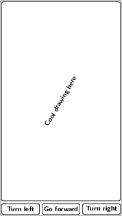
Anyway, for starters, I decided that my main activity will (for now) have just a canvas (where actual drawing will take place) and a few buttons for free-form drawing. Since it is so easy to change the text on the buttons etc., I decided to postpone finding (or making) suitable icons for the buttons etc. – they will hold just text for now. Also, I don’t really need much sophistication now (yet): just forward, turn left and right that’s it for now.
What was rather surprising for me, though, is that I didn’t find a way to do what I wanted with the “relative layout” idea. Here’s what I envisioned (more or less):
(Yes, I know I should design for a tablet and not a phone. Adding the “landscape” layout will be the next thing, and now it will be easy.)
It turns out that apparently there is no way to use Relative Layout to say that I want my buttons at the bottom to be just tall enough to contain the text (i.e., wrap_content), and the canvas for the image to occupy the rest of the height. I found something called PercentRelativeLayout on the internet, but I couldn’t use it (probably due to my lack of knowledge). I didn’t strive very hard, though: I knew I could always fall back to a vertical layout, where I could just assign a positive layout_weight to the ImageView, containing below a horizontal layout with the buttons. From what I here, nested layouts may be a performance problem, but you know what premature optimization is. If this becomes a problem (and honestly, I don’t believe it will), I’ll worry then.
What is more important is the “layout”, so to speak, of the data structures. What data structure am I going to use for my drawing? This question is crucial, and the answer will determine the direction I’m going to head next. But this will have to wait a bit – that’s it for today, folks.
