Some time ago I wrote about some ideas for a better layout. First of all, I wanted a switch for pen up/pen down; and while at that, I decided that I might as well change my Buttons into ImageButtons and draw some icons for turtle movement.
Boy, was it fun!
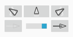
As everybody knows, when you know how to use a hammer, everything looks like nails – so my choice with respect to icons was (again) TikZ. It was not obvious at first how to represent the ideas of turning and movement as drawings, but after spending a few minutes thinking, I decided that what I wanted was an image of the turtle in the “end” position superimposed on its image in the “start” position (plus a few intermediate ones). After a few experiments I came up with this:
It’s not ideal yet – if you look closely, you’ll see the scaling problems, for instance – but it’s much better than words.
Also, notice how the switch is centered here. Quite surprisingly, it was far from trivial to achieve this effect!!! As this SO answer explained to me, there seems to be a bug in Android in the Switch view: it does not respect the gravity attribute. Come on, Google, this answer is one and a half years old, is fixing that really so difficult? Happily, the same answer gave a simple (if ugly) workaround.
By the way, I have to mention that I finally dropped the drag-and-drop layout editor in Android Studio. Writing XML by hand isn’t the most fun in the world, but it’s much, much better than using a mouse. And AS’s autocompletion works decently enough to make it almost a pleasurable experience. (I’m even tempted to say that I almost agree that XML is well-suited to writing these layouts. Of course Lisp syntax – or at least JSON – would be better, and using XML for that is still an abuse, but I can live with that.)
Coming back to my icons. I have a problem now. I admit that I did them in the most moronic way possible: if I want to change them, I have to manually run LaTeX on my TikZ file (which uses the standalone class and the \write18 trick to convert the pdf to png on the fly) and manually copy the pngs to the res directory. On the other hand, I’m not sure what the best alternative would be. My first thought – to write a Makefile automating that – has one drawback: why use make if I already use Gradle? On the other hand, I’m hesitant to put the TeX/TikZ source files instead of the generated bitmaps in the repository (and update the Gradle script to actually generate them), since this would introduce quite a heavy dependency for everyone trying to clone my project and play with it: the whole LaTeX installation (not to mention ImageMagick’s convert utility). (While I don’t expect lots of people cloning my project like crazy, if anyone actuall tries that, I don’t want to make anyone install TeX only to generate a few icons…) I still don’t know what to do. Maybe I’ll just include both sources and bitmaps.
Incidentally, horizontal layout was much, much simpler to do: I went with a single line of icons, with two “groups” of them: first the movement ones, then a small space, then the pen-up/pen-down ones.
Now to the clear-screen feature (yes, this is procrastination – or rather, gathering strength before I tackle the list-of-commands issue). Currently, it is implemented, but I’m not happy with it, so I’ll have to give it some loving care.
